Recently Google, Bing, Yahoo and Yandex has added support for schema.org video markup allowing you to index videos in a way that make your content relevant in search queries. Just few properties are required and might look like this:
<div itemscope itemtype="http://schema.org/VideoObject">
<h2>Video: <span itemprop="name">Title</span></h2>
<meta itemprop="duration" content="T1M33S" />
<meta itemprop="thumbnailURL" content="thumbnail.jpg" />
<meta itemprop="embedURL"
content="http://www.example.com/videoplayer.swf?video=123" />
<object ...>
<embed type="application/x-shockwave-flash" ...>
</object>
<span itemprop="description">Video description</span>
</div>
After you create the markup for your page is appropriate to test them with Google Rich Snippets Testing Tool to make sure it's correctly working, there is an additional information that significantly contribute to enhance the ranking of your videos on search results:
- Do not use any type of javascript for loading your schema.org markup
- Submit your video sitemap to provide additional information about you video content
- Make sure your videos are publicly available
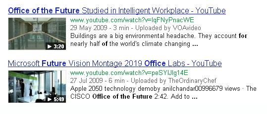
Video results appears in search and also in video results, everyday millions of people find videos on search engines, definitely schema.org video markup will give them more accurate results and will reduce time in the search process.